Problem: Their previous logo wasn’t meaningful—it was just a basic clipart-style serif font of “S89.” It didn’t represent their brand well, and if you didn’t already know who they were, the logo wouldn’t make much sense. Plus, the rest of their branding didn’t go beyond that basic logo.
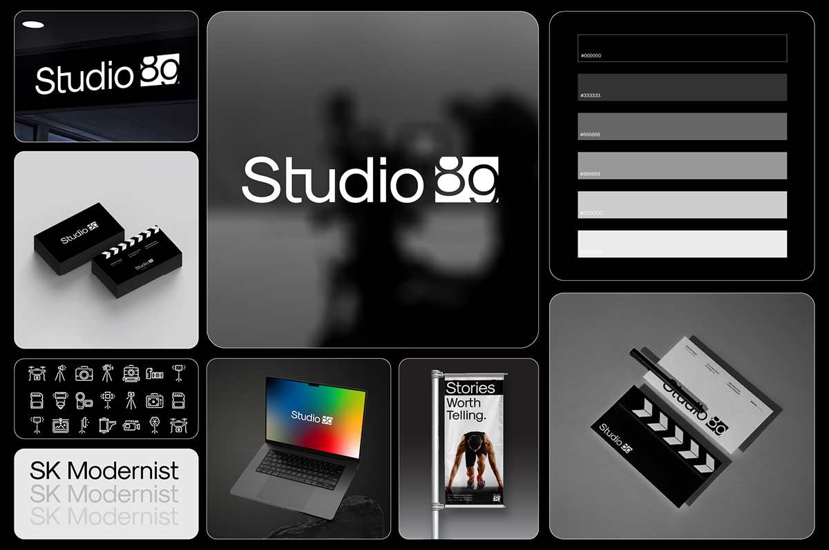
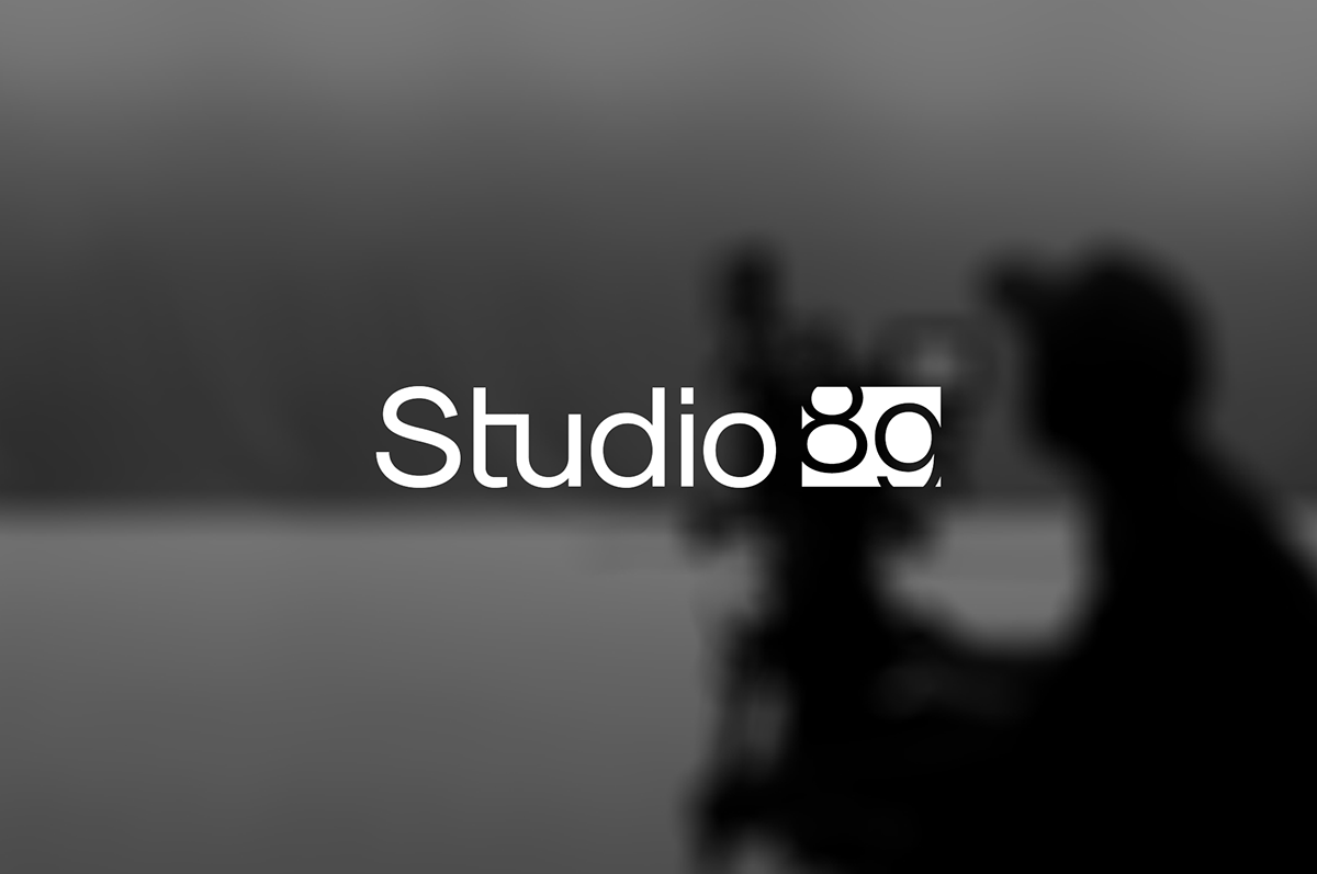
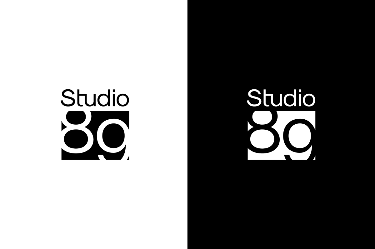
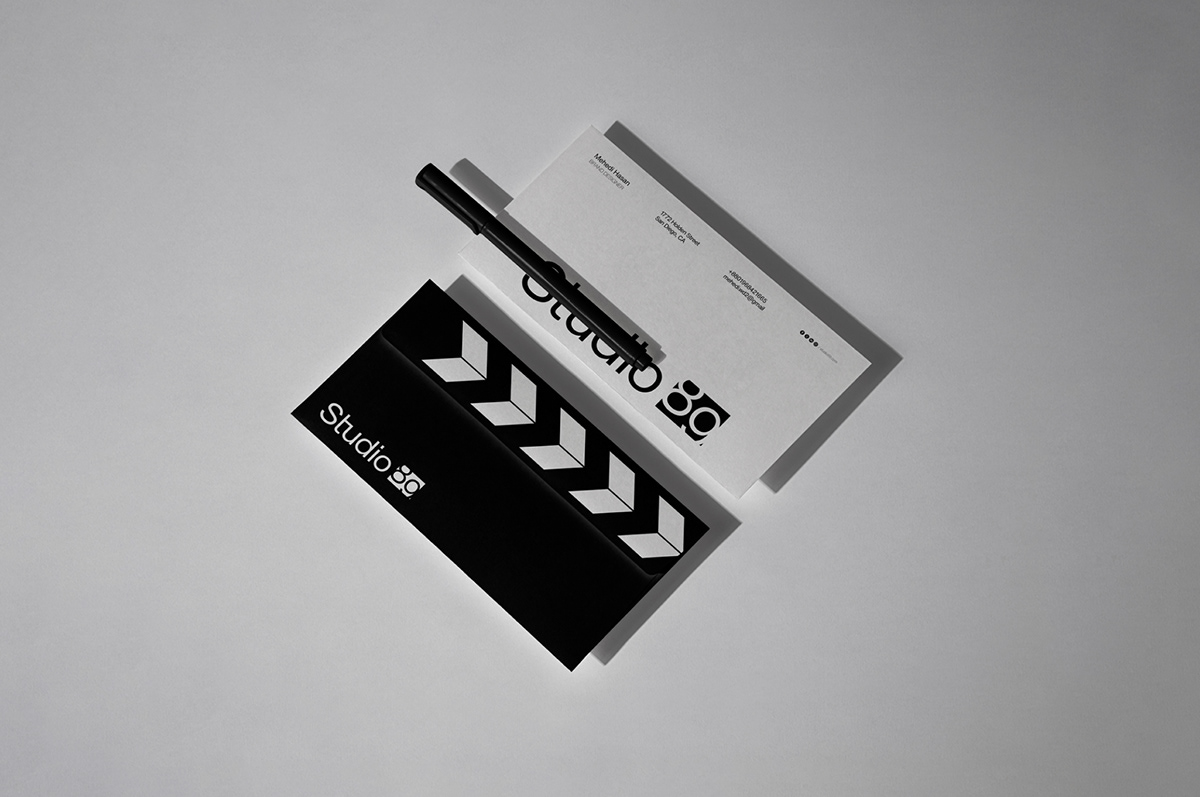
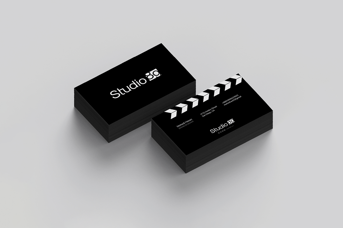
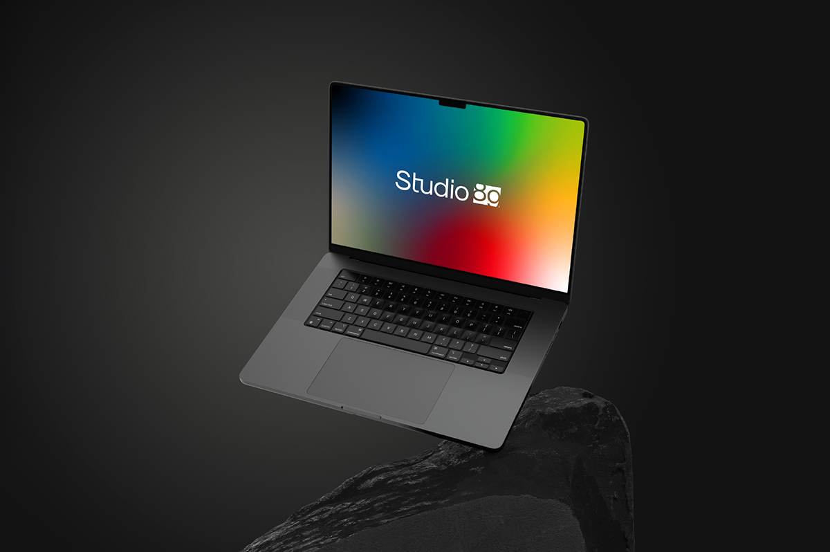
My Solution: I wanted to create something modern, minimal, and meaningful while keeping it super clean to reflect their standards. Black and white were a must-have for their color palette, so I worked on refining the typeface and added an “89” inside a box with a motion-inspired vibe. The numbers “8” and “9” appear to bounce and settle, which ties into their identity as a video production brand.
Since motion is a big part of their work, this logo design felt like the perfect fit. We’ll also be working on motion design for the logo itself, so it’ll truly come to life!